Josef Albers (1888-1976)
Homage to the Square
signed with artist’s monogram and dated ‘A66′ (lower right); inscribed with a handwritten description of media used and dated ’66’ (on the reverse)
oil on masonite
16 x 16 in. (40.3 x 40.3 cm.)
Painted in 1966
PROVENANCE: The Estate of Josef Albers.
The Josef and Anni Albers Foundation, Connecticut.
Acquired from the above by Leslie Waddington in 1998.
EXHIBITION HISTORY: London, Waddington Galleries, Elegant Austerity, 1998, no. 6 (illustrated in colour, unpaged).
Price Realised: GBP 389,000 Estimate: GBP 100,000 – GBP 150,000 Auction Closed: 3 Oct 2016
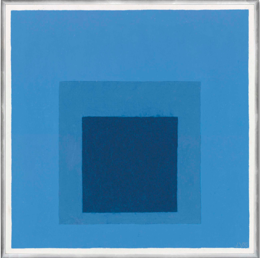
Josef Albers, was originally born in Bottrop, Germany on March 19, 1888 and was one of the pioneering forces of the Bauhaus movement. Albers came to the Bauhaus school in 1922. At the time, he was a prolific stain-glass maker. While Josef Albers spent time at Bauhaus, he eventually rose up to assume the position as a professor three years after having entered the school. Albers taught courses alongside other famous abstract expressionists in his time such as Wassily Kandinsky, Paul Klee and László Moholy-Nagy. It was in 1933 when the Nazis had shut down the Bauhaus and so Albers voyaged overseas to the United States to continue his passion of creating art, teaching, and further exploring colors and their qualities of universality. Albers alongside his wife Anni instructed and lectured seminars at Black Mountain College where they inspired contemporary abstract expressionist masters for instance, Robert Rauschenberg and Cy Twombly. By the 1950s, Albers advanced himself in his career as an artist and professor where he was appointed the head of Yale University’s design department. Josef Albers was always fascinated with the color theory and the manner in which we as humans perceive colors conceptually, physically, emotionally, and spiritually. Albers extensively studied color and he conducted research and writings on this oeuvre. Upon observing these various relationships between colors of various cool and warm tonalities, it was in 1963 when he published Interactions of Color which transformed the mindset of his fellow contemporaries and abstract expressionist artists.
It was during this time in the 1960’s when Albers oeuvre and style heavily impacted the art scene and his meticulous meteorology of curating color in art. Josef Albers’ most infamous series was known as Homages to the Square. Within this series of squares, we as an audience see layer upon layer of color that is ever so closely positioned next to each other. Albers cleverly investigated the impact of colors and their various hues, both light and dark, in this very precise placement in this approach which was known as the “push and pull effect.” This approach allowed Albers to shed a light on color’s ever-changing attributes. Colors and their idiosyncrasies blossom and reveal themselves subtly like the change of seasons. Colors transform, morph and unfold. Colors in a way appear like humans which may seem rather peculiar but this concept can be understood metaphorically. ‘They contain simple, great statements such as: I’m standing here. I’m resting here. I’m in the world and on earth. I’m in no hurry to move on. While Mark Rothko sought transcendence, Albers looked for fulfilment here on earth’ (H. Arp, quoted in W. Schmied, ‘Fifteen Notes on Josef Albers’, in Josef Albers, exh. cat., The Mayor Gallery, London, 1989, pp. 9-10), (Christie’s, Homage to the Square, 1966).
Upon observing Josef Albers’ oil painting on masonite, Homage to the Square, 1966 immediately we are struck by the effects of the color blue. Each of these three shades of blue all share an utter profoundness. We as an audience stare into the dark blue which envelops into a lighter tone of blue. Albers creates this almost hypnotic effect as though we dive into the very depth of a swimming pool which seems dark at its most intense bottom portion of the pool’s floor. However, after having dove into the pool, we swim upward towards the light which we see gradually sea changing the glistening light azure of the water. Albers possessed such a great deal of logic when mastering such a simple artistic formality of a square. “The water of a swimming pool with blue walls will look dyed with blue because of diffused reflection. Observing the white or blue steps within the water, we will discover that with each step down the blue of the water increases progressively, which presents a true volume colour effect,” quoted by Josef Albers, (Christie’s, Homage to the Square, 1966). What emerges as a simplistic idea was genuinely perceived as a complex and genius idea interwoven with the theorem of color and what color does to the human eye. Why are we instantly drawn to the dark blue towards the center of the artwork as opposed to the cerulean which outlines it? This is because we as humans when seeking anything spiritual or materialistic we always latch onto what draws in emotion. The dark blue captures our attention as drowns and fills our souls with an wave of equality and stoicism. Albers curated his colors in a controlled, togetherness. Albers utilizes this notion to quite literally “frame” the most intense of colors in the painting with the lighter colors. The cerulean which borders and frames the dark blue allows the audience to feel at ease. The dark blue although it is tranquil is rather powerful and audacious. Albers in a way renders the dark blue square to be “the window to our souls.” Albers the master of color properties and climates unearths an equilibrium and balance in his painting which is what ultimately provides peace and universality for himself and his audience.
By: Isabella Di Scipio