In the Western world, cinema has been the fastest-growing form of art and entertainment since the turn of the 20th century. Not until recently have films from outside the Western world had great success outside their home countries, but that does not mean that film-making outside of the West can just be swept under the rug, or thought of as unimportant. One man whose impact and influence on the world of film is highly regarded as one of the most profound contributions to its field is Akira Kurosawa – a Tokyo-born, Japanese director whose career spanned from the 1920s to 1998 when he passed away at the age of eighty-eight. Kurosawa is widely regarded as one of the greatest directors in film history and is certainly considered to be the best Japanese film-maker of all time. From gracing the field with his innovative techniques such as the screen wipe and the axial cut to his love of crafting a script – his originally desired career until he was convinced to do otherwise by his mentor, Kajiro Yamamoto – Akira Kurosawa’s contribution to the film industry cannot be overstated. Directors such as Steven Spielberg, Martin Scorsese, Roman Polanski, Wes Anderson, George Lucas, Quentin Tarantino, and many more, credit Kurosawa as being one of their biggest inspirations in their highly successful and decorated careers. Specifically, movies such as Dreams, Ran, Yojimbo, and Seven Samurai which are widely regarded as his best films, are often credited or mentioned as inspirations to filmmakers all over the world. The former two are known for their beautiful landscapes, contrasting bursts of color, intense interactions and altercations, and the presence of strong themes concurrent with Western notions of Japanese culture or one might say a sort of “Japan-ness.” While the latter two of the aforementioned films are also known for their beautiful landscapes and intense interactions and altercations, the one crucial difference between the former and the latter is the intentionality behind the use and the absence of color. This essay will focus specifically on scenes from Dreans (1990) and Seven Samurai (1954) to analyze and attempt to answer the question, of how important is color to our perception of what is Japanese or to what is ‘Japan-ness’.
When one thinks of what it means for something to be Japanese, one of the immediate associations – as with any nation – is the flag. Whether it be the emblem or crest that it displays or the colors that it is comprised of, Japan’s red rising sun – which has taken a few different forms over the years – is undoubtedly strongly associated with its national identity. Consisting of only red and white, the flag depicts, as its name alludes to, the sun rising off the horizon. Color theorists from Japan and around the world posit that the color red takes on several meanings, and most importantly has spiritually symbolic importance within Japanese culture. Juxtaposed with its flag counterpart, white, which is also spiritually symbolic, red and white take on a prominent role in festivals, architecture, clothing, art, and many other culturally significant matters. Themes such as life and death, wealth and prosperity, happiness and sadness, etc., are often associated with this juxtaposition in Japanese culture. All of these reasons are major contributors to the outside perspective of what something Japanese is because of its prevalence in society. With that being said, does that then change the perspective on whether or not red and white are inherently Japanese, or does that make them reflect a sort of “Japan-ness”? It could be argued that since there is undoubtedly cultural significance within Japan for these colors, they are Japanese. However, from the perspective of someone who does not know this significance, it is still an easy and readily available association to make, which therefore, I would argue, makes it more of a “Japan-ness” than actually Japanese. Instead of making the easy connection between red and white being Japanese, I believe colors more true to the cultural spirit of Japan would be colors like green and blue, which are often associated with the concept of Zen or Zen Buddhism, life, and nature.
With all of the aforementioned in mind, you may now be wondering how these concepts tie into this essay’s overall theme or question, which has to do with the use of color or no color and how it impacts the perception of “Japan-ness.” To provide a brief explanation of what “Japan-ness” is, it must first be understood that there is a big difference between something that is Japanese and something that displays “Japan-ness.” As I touched on earlier, something that is Japanese has an internal consistency among their people as to what living and having ancestry in Japan means. Whereas “Japan-ness” has no internal consistency within Japan, and is more so based on the perception of Japan from the exterior world, more specifically the West. Essentially, we can distinguish between the terms based on the use of “ness,” which implies that something has the qualities of being Japanese but does not mean that the thing itself is Japanese.
Now that we have identified the differences between Japanese and “Japan-ness,” we can analyze how Akira Kurosawa utilized color and the absence thereof to impact the viewer’s perspective. For the color films, the first movie – and then descending in chronological order – Dreams by Akira Kurosawa and Martin Scorsese, released in 1990, showcases some of the most beautiful and profound usages of color in any film to date. Some might consider it almost exorbitant how much color there is, but that’s what makes it perfect for our analysis purposes. Starting with the picture below, the scene depicted takes place in a peach orchard and is referenced as “the Doll Festival.” The ascending terraces, where peach trees would normally be, have transformed into the spirits of the trees, and have taken on an arrangement of rather striking clothing that appears to be very traditional and ceremonial, Japanese garb. The inclusion into nature is important to recognize because not only does the green of the surrounding nature serve as a medium for contrasting with the spirits’ clothing, but it ties into the
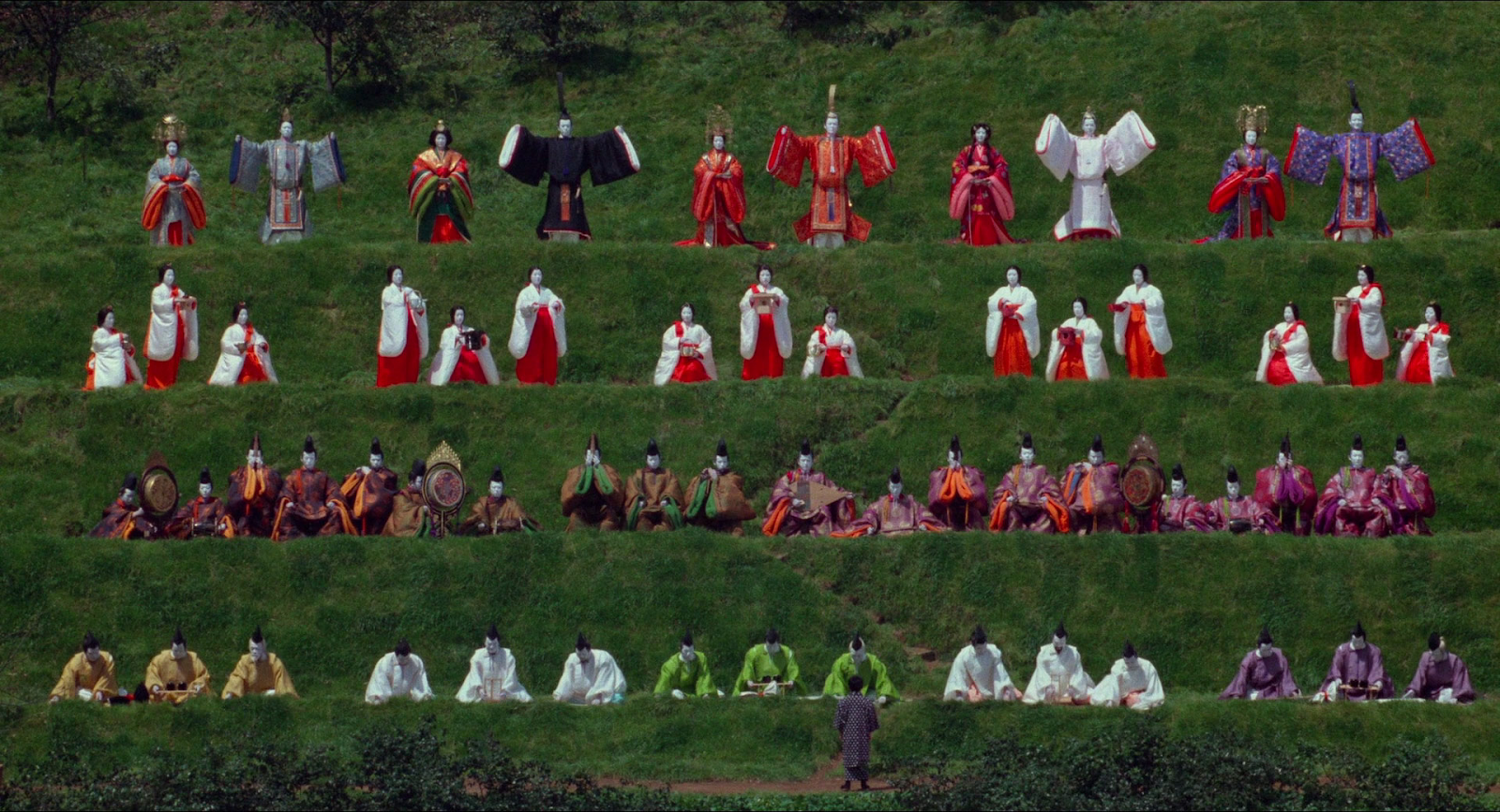
(Akira Kurosawa, “Peach Orchard ‘Doll Festival’,” 1920 x 1040, 1990, Japan, Dreams, Warner Bros.®)
Disclaimer: 1) All screencaps and images are the copyright of their respective movie studio and are reproduced here under the Fair Use doctrine. Any usage from here forth should be restricted to non-commercial purposes. 2) The stills contained in this essay have been cropped and had compression applied and are not a truly accurate representation of the video quality inherent in the DVD or Blu-ray transfer.
values of Zen Buddhism and the application of such values in Zen artistry and architecture. Kurosawa layers the scene from top to bottom – in descending order – with brightly colored to more muted and less pronounced clothing, but what immediately catches the viewer’s attention are the very bright red and whites of the upper-level people’s clothing. As I mentioned before, the red and white are symbolic of Japan especially from the outside or Western perspective of Japan, since the national flag of Japan is the red Rising Sun on a white background. The combination of traditional Japanese garments and heavily Japanese-associated color schemes, create a seemingly Japanese scene, but from an outside perspective a sort of “Japan-ness.”
Disclaimer: 1) All screencaps and images are the copyright of their respective movie studio and are reproduced here under the Fair Use doctrine. Any usage from here forth should be restricted to non-commercial purposes. 2) The stills contained in this essay have been cropped and had compression applied and are not a truly accurate representation of the video quality inherent in the DVD or Blu-ray transfer.
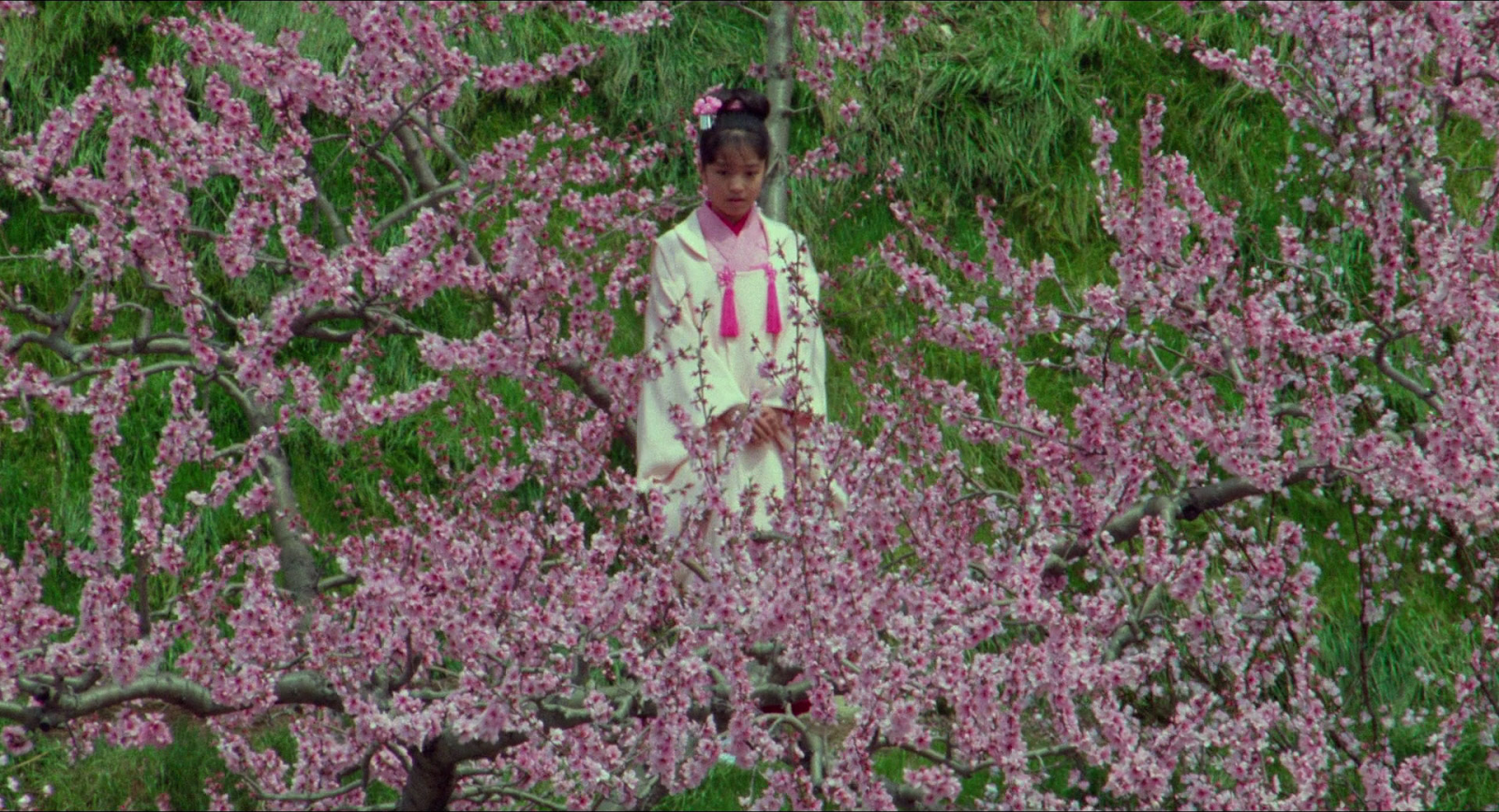
Moving on to our next shot which was from the same scene within the peach orchard. Immediately the viewer is caught in the tree’s blossomed flowers, which almost engulfs the shot, except the young female tree spirit right in the center. I found this shot particularly interesting and thought-provoking because my immediate thought was that I was looking at cherry blossoms. Another close association not only within Japan but also from the exterior/Western perspective of Japan, cherry blossoms have an important spiritual and cultural meaning to the Japanese, which is why one might assume that this is a cherry tree. That being said, this is not a cherry tree, as we know we are in a peach tree orchard, so this is a peach tree. This distinction, however, may not be made by non-Japanese viewers, and it might be assumed that since the film is Japanese, it must be a cherry tree. This again boils down to a lack of understanding from outside perspectives, as well as the color associations made that cherry blossoms are pink and the cultural associations of cherry blossoms having importance in Japanese culture which all tie together to reflect “Japan-ness”
Now that we have established how color contributes to “Japan-ness” and the ease at which it achieves such, we can move on to conversely, how the absence of color can achieve the
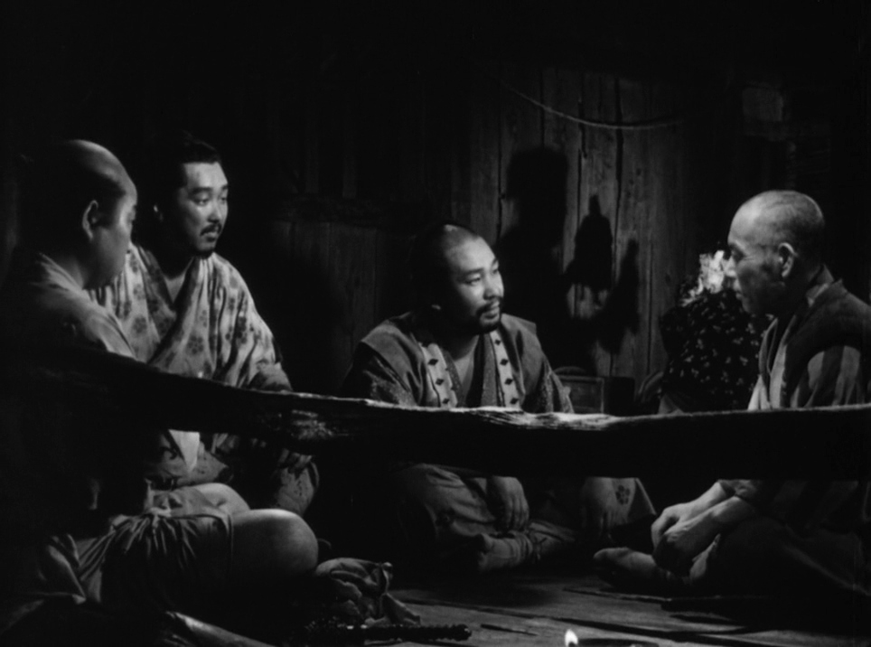
(Akira Kurosawa, “Assembly of the Samurai,” 1920 x 1040, 1954, Japan, Seven Samurai, Kurosawa Production)
Disclaimer: 1) All screencaps and images are the copyright of their respective movie studio and are reproduced here under the Fair Use doctrine. Any usage from here forth should be restricted to non-commercial purposes. 2) The stills contained in this essay have been cropped and had compression applied and are not a truly accurate representation of the video quality inherent in the DVD or Blu-ray transfer.
same or similar feelings of “Japan-ness.” Detailed in the shot above, we have the first time all seven of the samurai are assembled in the same place. They have gathered together inside an old village, staying at an inn – the interior decor of which contains many components of Japanese culture. One of those components is the architectural concept of Wabi Sabi, which highlights the use of imperfection and the natural existence of the materials. Immediately the viewer’s line of sight is obstructed by the wonky wooden rail and the wooden panels that make up the wall behind our characters also highlight the imperfection of the assembly of the building. Another
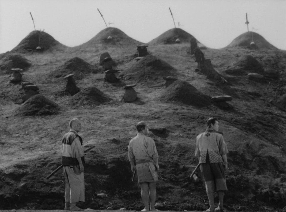
(Akira Kurosawa, “Final scenes,” 1920 x 1040, 1954, Japan, Seven Samurai, Kurosawa Production)
Disclaimer: 1) All screencaps and images are the copyright of their respective movie studio and are reproduced here under the Fair Use doctrine. Any usage from here forth should be restricted to non-commercial purposes. 2) The stills contained in this essay have been cropped and had compression applied and are not a truly accurate representation of the video quality inherent in the DVD or Blu-ray transfer.
shot that emphasizes this concept of imperfection is the cemetery for the fallen samurai and villagers. As we can see above, the three remaining samurai stand in front of the randomly located and varying in size and style graves of their comrades. Concepts such as asymmetry and perfect imperfection exist throughout Japanese art, architecture, and culture, but often the opposite is assumed by foreign or Western perspectives who stereotype the Japanese as being meticulous and perfectionists. One could argue that if the movie had color, it would be easier to notice the imperfections and other details within the scenes, and I think that is a valid point to make. Without color, the viewer is drawn to the shot’s other aspects such as the traditional clothing, hairstyles, and expressions of the samurai – such as the images above and below – which

(Akira Kurosawa, “Kikuchiyo’s New Armor,” 1920 x 1040, 1954, Japan, Seven Samurai, Kurosawa Production)
Disclaimer: 1) All screencaps and images are the copyright of their respective movie studio and are reproduced here under the Fair Use doctrine. Any usage from here forth should be restricted to non-commercial purposes. 2) The stills contained in this essay have been cropped and had compression applied and are not a truly accurate representation of the video quality inherent in the DVD or Blu-ray transfer.
all contribute to the more generalized version of Japan or demonstrate “Japan-ness” in their qualities, rather than actual Japanese concepts like Wabi Sabi, asymmetry, and perfection within imperfection.
It can be confusing for humans to grasp that we are from a young age filled with ideas or assumptions about places and people – usually unintentionally – and it is hard to accept the notion that some of the core defining features of something – within your mind – do not have the same internal consistency within the place or among the people you are thinking about. From a Western background, it takes effort, research, and the intent and desire to understand the true values and customs of a culture outside of the West. Sometimes even the basic aspects of everyday life, such as the color that fills our eyes every waking moment, can lead to a surface level or generalized understanding of other cultures. Akira Kurosawa understands that for people to appreciate art and architecture, we must sometimes be deprived of the senses and psychological predispositions that are innate within humans. When it comes to movies, we often think of the story, the setting, and other background factors as what decides the content of the movie. However, the true way in which humans consume and understand the content we take in is subconscious and out of our control, which is why the perception of color is so important to conveying messages within art, architecture, and in this case film. Ultimately, being aware of the influences color has on the themes being portrayed such as “Japan-ness” or what it means to be Japanese is crucial to appreciating and understanding films from different cultures, and is especially important to appreciating the artistry of Akira Kurosawa.
Works Cited
Charlene Lewis, 2005. “Japanese Color Meanings – Symbolic Colors in Japanese Culture.” Art in
Context, 6 Nov. 2023, artincontext.org/japanese-color-meanings/.
Keirstead, Thomas. “Using Film to Explore History.” FSI,
spice.fsi.stanford.edu/docs/using_film_to_explore_history. 22 Oct. 2023.
Kurosawa, Akira, and Bert Cardullo. Akira Kurosawa: Interviews. University Press of
Mississippi, 2008.
Kurosawa, Akira, director. Dreams. Warner Bros., Ltd., 1990.
Kurosawa, Akira, director. Seven Samurai. Toho Co., Ltd., 1954.
Sato, Yasuko. “The Essentials: Seven Samurai.” Association for Asian Studies,
www.asianstudies.org/publications/eaa/archives/the-essentials-seven-samurai/.